IQS uses standard browser-based navigation. Editing information in the application is done through 2 types of data entry screens. One type contains separate fields or controls and displays one record of information at a time. The other type contains a grid listing horizontal rows of information displaying several records at one time. Icons or links are available on all data editing screens with options for inserting, updating, deleting records and canceling record changes.
To view information regarding a specific topic for navigating IQS click on the link below.
Helpful Hints:
The IQSweb application utilizes pop-ups. For IQSweb to function properly, pop-ups must be enabled for your IQSweb home page URL. There are many pop-up blockers available on the Internet, two of the most common are the Internet Explorer (IE) built-in pop-up blocker and the one on the Google tool bar.
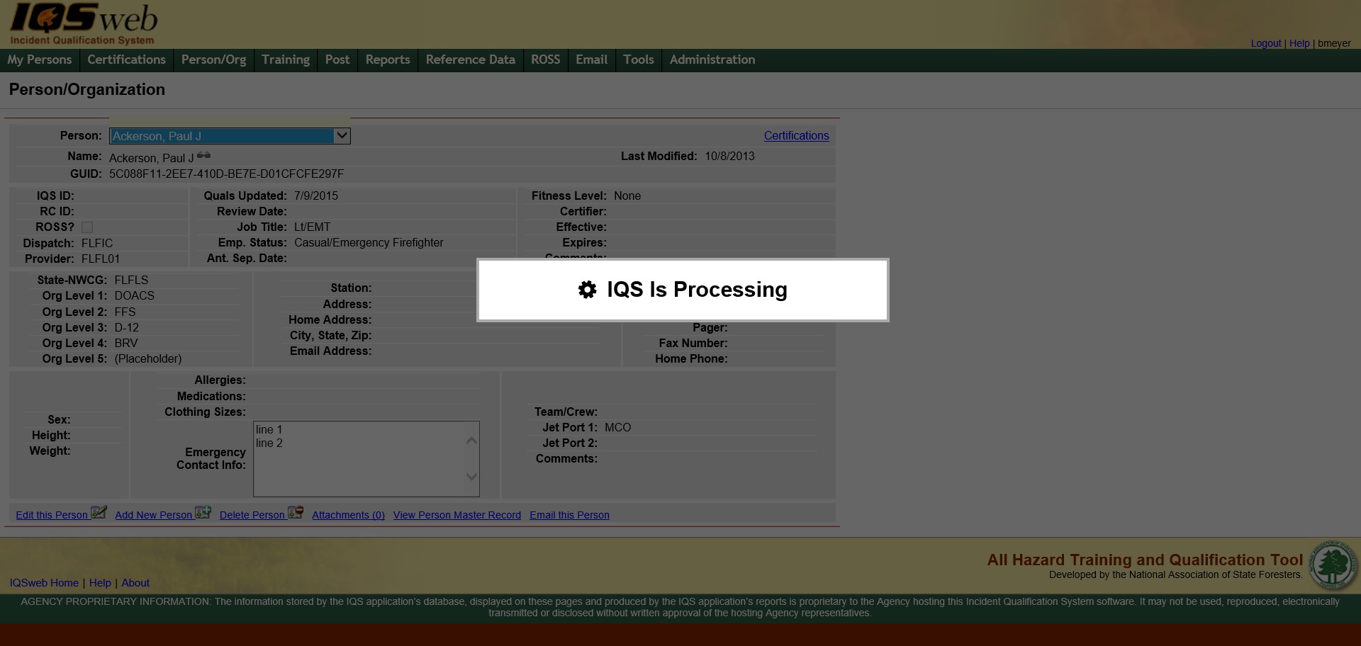
After performing a function in IQSweb, the "IQS is Processing..." notification may be displayed across the middle of the page to let you know IQSweb is performing some sort of function and will most likely need time before you can continue interacting with the current screen or change to a new screen
When this banner is displayed, you must wait to continue entering/editing data or clicking menu options or links. Once the processing message disappears, you can continue using IQSweb.
The "IQS is Processing..." banner is displayed while performing a function within a screen. However, the progress bar is displayed at the bottom of the screen when selecting a menu or sub menu item . A new web page is loaded and the green status bar provides the progress of the page that is loading.
Add a new row - Left click on the Add button  located at the bottom left
below the grid. A new blank record appears at the bottom of
the grid for you to enter the new information.
located at the bottom left
below the grid. A new blank record appears at the bottom of
the grid for you to enter the new information.
Edit a row - Left click on the Edit button  located in the far left columns
of the row in which you want to edit. The row is now in edit
mode and you can change information in each cell.
located in the far left columns
of the row in which you want to edit. The row is now in edit
mode and you can change information in each cell.
Delete a row - Left click on the Delete button  located in the far left
columns of the row in which you want to delete. You will receive
a delete confirmation message allowing you to continue with the delete
or cancel the delete.
located in the far left
columns of the row in which you want to delete. You will receive
a delete confirmation message allowing you to continue with the delete
or cancel the delete.
View Last Modified By and Date information - hover
over the Sunglasses icon  located to the right of the Delete a row icon. The name and
date of the last user to modify the record will be displayed if it
was someone other than yourself. This icon is only displayed
in the Certifications tabs. The user must also have "Auditor"
checked on their user information.
located to the right of the Delete a row icon. The name and
date of the last user to modify the record will be displayed if it
was someone other than yourself. This icon is only displayed
in the Certifications tabs. The user must also have "Auditor"
checked on their user information.
Save changes in a row - Left click on the Update button
 to save inserted
or edited information
to save inserted
or edited information
Cancel changes in a row - Left click on the Cancel
button  if you do not wish to save a row you are adding or changes to a row
you are editing.
if you do not wish to save a row you are adding or changes to a row
you are editing.
Navigate between fields - Use the Tab key on your computer keyboard to navigate through the fields or left click on each individual field.
Drop-down lists - In edit or add mode, you can use
the drop-down lists to select data by left clicking on the Drop-down
list button  . Then left click on
the data you would like to select. You can also select data
by using your up and down arrow keys on your computer keyboard to
navigate through the list. To search for a value in the list,
start typing the first characters of the value you want. The
characters you type will be displayed above the list as you type.
The contents of the list will be narrowed down based on the
values matching the search characters you type.
. Then left click on
the data you would like to select. You can also select data
by using your up and down arrow keys on your computer keyboard to
navigate through the list. To search for a value in the list,
start typing the first characters of the value you want. The
characters you type will be displayed above the list as you type.
The contents of the list will be narrowed down based on the
values matching the search characters you type.
Selecting Dates - When entering a date you can either
enter the date manually or left click on the Calendar button  and select by left clicking the
date.
and select by left clicking the
date.
Page to Page Navigation - To navigate between pages
of a table you can either use the drop down list to select a page
number you would like to view or click on the Prev or Next links
to navigate through one page at a time  .
The page to page navigation links are located at the bottom
of each screen.
.
The page to page navigation links are located at the bottom
of each screen.
Records Displayed per Page - by default, 15 records are displayed per page for a grid. You can re-set that value up to 100 by selecting a different value in the Records Per Page: control that is located to the right of the Page navigation control.
Gird Horizontal Scroll - Some grid screens use a vertical
scroll bar  on the far right
of the page to move up and down the page if the list of data exceeds
the page viewing area.
on the far right
of the page to move up and down the page if the list of data exceeds
the page viewing area.
Searching for Records - You can utilize the search
capability by typing search strings in the "Search in Code or
Course Title Columns for" field if present above the grid. Press
the Go button  to get a
list of data that meet the search criteria. This is typically
located at the top of the screen.
to get a
list of data that meet the search criteria. This is typically
located at the top of the screen.
Sorting
rows - The columns that can be sorted will have an arrow to the right
of the column heading. Left clicking on those column headings
will allow the user to sort within that column in ascending  or descending order
  .
.
Some
of the grids use pop-up windows for editing rather than in-line editing
as seen below. When using a pop-up window, insert the information
by using the drop down list button , calendar
button ,
and/or check boxes  where applicable. After
you have inserted your information, click on the OK button
where applicable. After
you have inserted your information, click on the OK button  to save the information or the Cancel
button
to save the information or the Cancel
button  to not save the information which will also close the window.
You may also click on the X located at the far right corner
of the pop-up window to close as well. Any of those three options
will close the window and return you to the original screen.
to not save the information which will also close the window.
You may also click on the X located at the far right corner
of the pop-up window to close as well. Any of those three options
will close the window and return you to the original screen.

When checking or unchecking check boxes you can use the tab key to tab to the box you would like to modify and then use your space bar. This will enable you to work on a screen without having to use your mouse.
can be used when selecting
a date to be entered on the screen. Select the date you would like
entered by clicking on that particular date. When you initially
click on the calendar button the current month and year will be displayed
from which you could choose a day. If you click on the current month
and year at the top of the displayed calendar you will get all of the
months in the year, so that you can change the month by clicking on the
month you would like to choose and that month's calendar will then be
displayed. If the date you desire to choose is within a different
calendar year you can click on the year at the top of the displayed calendar
and you will be given the option of 12 years to choose from.In some grids, the > symbol appears in the far left grid column. This symbol indicates an entire record can be selected in the grid. In this case, selecting a record usually populates another grid on the same page with data based on the record selected. For an example, see Certifications/Target Positions.
Drop-down lists appear in both grids and one record pages in add and
edit modes. You can use the drop-down lists to select data by left
clicking on the Drop-down list button
that appears to the right of the field cell. Then left click on the data
you would like to select. You can also select data by using your
up and down arrow keys on your computer keyboard to navigate through the
list.
To search for a value in the list, start typing the first characters of the value you want. The characters you type will be displayed above the list as you type. The contents of the list will narrowed down based on the values matching the search characters you type.
NOTE: Apostrophes are not recognized in the drop-down searches. If you are searching for a value that contains an apostrophe, search using the letters up to the apostrophe and then scroll through the list to find the value.
Background Colors on fields indicate:
Green – Field is required to be completed in order to continue processing or save the record.
Red – Indicates value is expired. For example if the expiration date on a qualification is background Red, the qualification has expired.
Yellow – Indicates the value is within the warning period prior to expiration.
Blue – Indicates a record is selected within a grid (may vary with your windows settings). The blue background will appear on the entire row.
Light Yellow - If your screen shows some of the fields highlighted in light yellow this is because of a setting in the Google toolbar that has an auto fill feature. If you would like to change the setting so that fields are displayed properly go to Views/Toolbar on your browser and make sure that Google is unchecked.
A filter is used to query a subset of the records. Frequently within IQS, records will be filtered by the agency so only the records belonging to a given organizational level are displayed. IQS uses two kinds of filters. First, the reports section uses a series of screens that we call filters. The filters are used to pull the subset of information you want for a particular report. Secondly, filters are used within the application to display a subset of data for a specific organization on a screen. This type of filter is shown below.
An Org filter provides 6 drop-down columns for the user to select a combination of State-NWCG and Org Level 1-5 values to be used to filter a record set. Once the user enters the 6 values, the records are automatically filtered. The person record set is filtered selecting only those persons who have unique combinations of State/NWCG and Org Levels 1, 2, 3, 4, and 5 that match those selected by the user in the filter.
Oftentimes, a user supplies the same values for the filters over and over again. Your default Organizational Level Access (OLA) will appear in the filters automatically. The values can be changed if the user desires to use different filter values. See menu option Tools/Change Default OLA for information on setting your default OLA. During a session, the last filter value you used will be defaulted to other filters until you log off.
In the example below the State-NWCG is MNMNS and Org Level 1 is DNR. The wildcard is used in the remaining Org Levels. In this example, the user will view information for all Org Levels within the MNMNS, DNR. If your OLA allows, you can see all records in database regardless of State-NWCG by using a “Wildcard” is used in this field.
Oftentimes, a user supplies the same values for the filters over and over again. If your IQS user id has a default Organizational Level Access (OLA) defined for it, these values will appear in the filters automatically. The values can be changed if the user desires to use different filter values. See menu option Tools/Change Default OLA for information on setting your default OLA.
When using Internet Explorer 8, you may not be able to see the information in the secondary menus. Therefore, you will have to navigate to Tools/Compatibility View Settings and select "Display all websites in Compatibility View" on your IE toolbar. The secondary invisible menus will then appear.
A menu item can be opened in a separate window by right clicking on the menu item and choosing "Open in New Window" in the pop-up menu. A separate window will now be opened so that you can have two menu items open at the same time.
